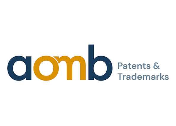
Today we’re introducing a new look for AOMB! With a new logo, fresh colors, and an updated design, we’re making it easier to see who we are and what we do.
Our logo puts our expertise front and center with the words AOMB Patents & Trademarks. At the heart of the design are the O for octrooien (patents) and the M for merken (trademarks). The two letters wrap around each other, reflecting something that matters just as much to us as our expertise. It’s the personal way we work with you.
Working well together takes more than expertise. It means taking the time to listen and understand what you’re trying to achieve. It means having someone you enjoy working with, who thinks things through with you and helps you find a way forward.
We want that human side of AOMB to come through more clearly in how we look and how we communicate, alongside the expertise and professionalism you’ve come to expect from us.